| About |
Creating a New Visual Brand and Website for SAMCAR
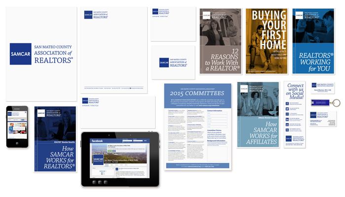
You may have noticed that over the course of 2014 SAMCAR's branded look has undergone a bit of an update. And, in June 2014, we officially launched a brand new website. We're proud of the process we used to execute a complete visual re-branding while simultaneously re-designing the Association Website, so we wanted to take a chance to explain how we got to where we are at today and where we'll continue to go.
Slide Deck: "Creating a New Visual Brand & Website for SAMCAR"
SAMCAR Visual Identity Guidelines 
Success Through Process
In 2013, SAMCAR's staff and leadership read an excellent book called "Race for Relevance," that outlined many ways that associations like SAMCAR must continue to remain relevant to their dues paying membership in order to thrive in the 21st century. Among many great points, the book emphasized optimizing our core competencies. For an association, that means finding what it is that we are great at delivering, and continuing to deliver it in the best way. For a project like re-branding and re-designing the website, this meant identifying expertise among our talent pool (staff, leadership, members, vendors) and letting each do their best.
Our in-house MARCOM (Marketing and Communications) team — Nasreen Wills, Director of Marketing, Communications, and Programs, and Dalen Gilbrech, Lead Visual Designer — undertook the role of project management. We identified areas that required the most attention, sought input from staff and members at manageable and meaningful junctures in the projects, and employed best practices to effect a well-suited and functional solution. We worked with SunStar Media to implement and maintain the back-end of our website, which relies on our membership database A R Richburg MembershipDirector for important log-in features like member profiles and online bill payment, as well as other database-synched features like our online member directories. Early on we used member feedback from communications surveys to lay the groundwork for what concens and needs we had to address with a new website. By simultaneously understanding best practices for communications and design, we also realized that a visual re-branding would go hand-in-hand with a new website. And, through the process, we asked Association staff to pay attention to what members needed and what content is most relevant to members as well as property owners. We also had extant web analytics from the previous version of samcar.org to guide us with information on user behavior like which pages were most visitied. Our Board of Directors beta tested the initial version of the new website, helping us identify aspects of site architecture and navigation that needed to be made more intuitive for our members. And then we launched, with a new website based on constantly up-to-date content and easy ways to accept member feedback.
Read more about the new samcar.org
What was wrong with the old logo?
SAMCAR's old logo may never have crossed your mind, but after 10 years, one thing was for certain: it needed to be updated. When the swashy script and detailed illustration of SAMCAR's previous logo were designed by a local artist in 2003, the marketing, communications and media landscape was vastly different. A logo might appear on standard collateral like business cards and letterhead, but its inclusion on a website or even social media was an afterthought at best. The old logo was visually cluttered and dated; qualities that were only exacerbated by its appearance on small screens like the smart phone. As the new audience of SAMCAR members approaches the brand more frequently from the web or even social channels, we knew we needed to have a visual brand that reflected this shift and would be adaptable to other such technological changes that keep happening at a faster pace.
How we arrived at the new logo
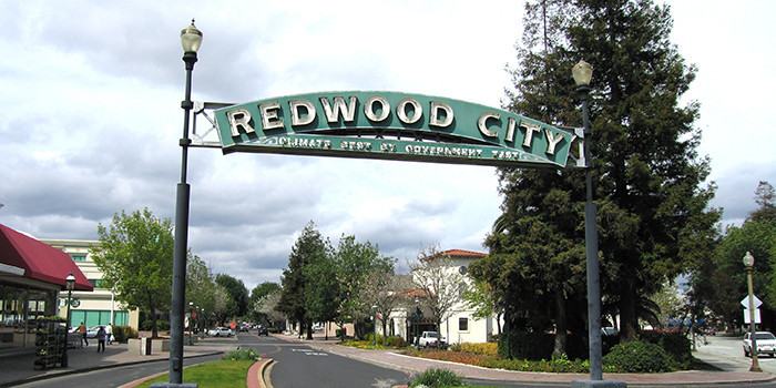
San Mateo County is uniquely positioned between the cultural and historic center of San Francisco to the north, and the innovation hub of Silicon Valley to the south. Both these places evoke plenty of imagery from iconic landmarks like the Golden Gate Bridge, the Painted Ladies or the TransAmerica Pyramid, to the microchip, the smart phone, and the elusive "network." But what makes San Mateo County unique between these giants? We have the best of both, plus our own special character. While we don't have an instantly recognizable single landmark that could define the whole county, we do have the unique flavor of the cities on the peninsula. In looking at city identification signs up and down the peninsula, we saw a common thread of beautiful, historic typography, ALL CAPS, geometric sanserifs. Type treatments that evoke a period in history connected to San Mateo County's flourishing and continued growth through historic and economic changes in our area that continue today. The blue square proclaiming our association acronym "SAMCAR" evokes this style of signage seen throughout San Mateo County in a simple graphic gesture that conveys well across the media we use today, which includes traditional print media as well as the web and social media, from letterheads and banners to the tiny screens of your smart phones and tablets. The new SAMCAR logo is also a responsive identity system that works across these varying media. It works well with the brands of our parent associations - California Association of REALTORS® and National Association of REALTORS® - as well.
Elements of Visual Style
Typograhy
To work cohesively across print, web and social properties, we specified a type palette that could convey familiarity and friendliness as well as innovation and authority. Myriad Pro and Chapparal Pro both straddle those lines effectively, with humanist flavor, helping relate to the eye of the reader, but also with the gravity to convey SAMCAR's authority as a property rights advocate, and innovation as a local leader. Inside the logo, the "SAMCAR" acronym uses a classic geometric sanserif similar to the ones found on many local signs. And in staff and director generated report formats, we specified Calibri because it would be easiest for everyone to adopt across all our different operating systems and platforms, and shares similar characteristics with Myriad Pro.
Color
We also poured over pages and pages of swatches to identify a color palette that would convey SAMCAR's character as a local leader and familiar place. The minimal color palette helps identify our brand readily across different types of collateral and web spaces. And unlike the brands of old, we only identify one Pantone swatch for our minimal spot printing needs (letterhead, envelopes, business cards). Otherwise, we use mostly "hex code" (a six digit alphanumeric code identifying colors for web) because of how much the SAMCAR brand lives online, and traditional CMYK (cyan, magenta, yellow, black) for digital printing which is done in-house at SAMCAR.
Check out SAMCAR's Online "Style Guide"
Brand Values
The SAMCAR brand is broadly defined by a set of values that guide Association initiatives and communications, including trust, responsiveness, and familiarity. As an association representing nearly three thousand real estate professionals in San Mateo County, SAMCAR recognizes its responsibility to represent issues and positions accurately, demonstrating the trust we strive to earn and keep. As a local association, we're also nimble enough to be responsive to member feedback and changes in our region so we can innovate on meaningful solutions and programs. And, being part of such a relationship-based business, we pride ourselves on the personal touch—SAMCAR staff know many members by name and face, and part of what members have come to associate the "SAMCAR brand" with over the years is tied very closesly to that familiarity. So, whether we're mobilizing members and homeowners with a call for action, hosting a technology seminar, or communicating a member benefit, we have this guiding set of values and a companion visual style guide of to communicate these ends clearly.
The "4 R's"
Tied in to these brand values are the SAMCAR's "4 R's" Resources, Representation, Responsibility, and Relationships. These 4 R's convey the core value of SAMCAR membership, and recur through collateral helping us align association marketing and activities with the purpose of the SAMCAR Mission Statement.
See the 4 R's at work explaining REALTOR® Member Benefits